
우아한형제들(Woowa Brothers)이 운영하는 배달 플랫폼 배달의민족(Baedal Minjok)은 대중에게 더 가까이 다가서기 위해 한글 글꼴을 개발해 무료로 배포하고 있다. 그중 을지로체(Baemin Euljiro) 시리즈는 을지로의 지역적 특성과 역사를 오롯이 담아낸 진정성 있는 서체로 평가받으며 화제가 되었다.
Delivery platform Baedal Minjok has an unusual side business: the company develops and freely distributes fonts. Its lineup includes the Euljiro fonts, which were inspired by an eye-catching sign and celebrate the spirit and history of the eponymous neighborhood in downtown Seoul.
배달의민족[이하 배민(Baemin)]은 기발한 기획력과 마케팅 감각을 지닌 기업으로 잘 알려져 있다. 이들이 진행하는 위트 넘치는 프로젝트들은 젊은 세대에게 인기가 높다. 한글 서체 개발도 그중 하나이다. 배민은 2012년부터 매년 무료로 한글 서체를 배포해 소비자들이 실생활에서 사용할 수 있도록 해 왔다. 이들이 본업과는 거리가 먼 일을 십 년 넘게 이어오고 있는 이유는 무엇일까?
“남들이 안 하는 거잖아요.”
한명수(Han Myung-su, 韓明洙) COO의 대답이다. 그는 싱글싱글 웃으며 덧붙였다.
“게다가 재미도 있고요.”
Baedal Minjok, commonly known as Baemin, is a popular delivery platform known for its witty marketing campaigns, but unusually, its portfolio also includes developing new fonts in Hangeul, the Korean alphabet.
Baemin has been offering its fonts as free downloads since 2012. According to the company’s chief operating officer, Han Myeong-su, the reason is simple: “No one else does it.” He adds with a smile, “And it’s fun.”
그는 그동안 가장 재미있었던 서체 개발 작업으로 2019년 출시한 을지로체를 꼽는다. 첫 작업이었던 한나체(Baemin Hanna, 2012)를 비롯해 주아체(Baemin Jua, 2014), 도현체(Baemin Dohyeon, 2015) 등 기존에 공개한 서체들은 길거리의 오래된 상점 간판에서 아이디어를 얻었다. 을지로체는 여기서 한발 나아가 오래된 간판들이 다수 남아 있는 을지로 지역 전체를 주제로 한 프로젝트였다.
Han becomes especially animated when describing a font the company released five years ago. Like three previous Baemin-designed fonts — Hanna, Jua, and Dohyeon — it was inspired by the writing on old, weathered signs. This time, however, the company went one step further and themed the font exclusively on the old signs of the Euljiro area in the heart of Seoul.
을지로체의 원형 – ORIGIN OF THE EULJIRO FONT
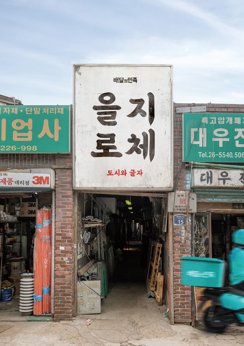
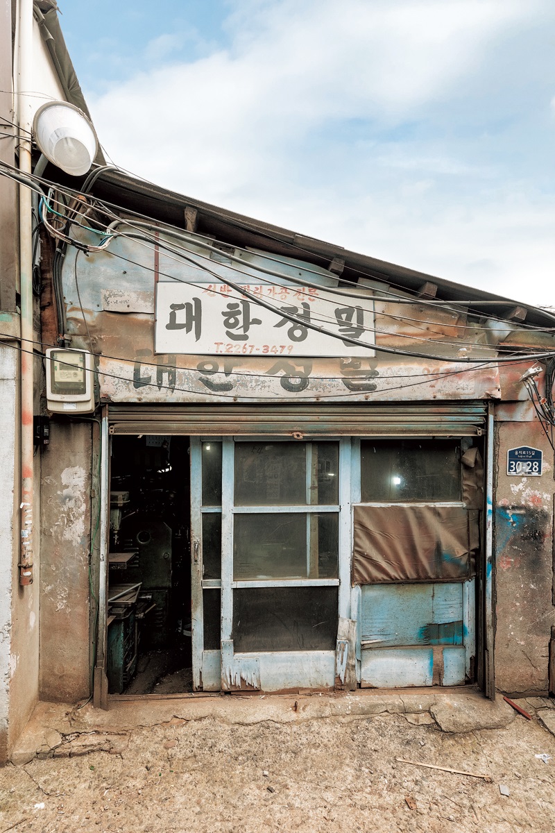
우아한형제들의 창업자 김봉진(Kim Bong-jin, 金奉眞) 의장은 디자이너 출신으로, 기업을 운영하기 전부터 한국의 오래된 간판 글씨에 관심이 많았다. 그의 휴대전화에는 길거리 간판을 찍은 수천 장의 사진이 저장되어 있는데, 그중 특히 좋아한 것은 1960~70년대에 제작된 을지로 간판들이었다. 을지로 공구 거리에서 흔히 볼 수 있는 이 붓글씨 간판들은 모두 당시에 ‘간판 할아버지’라 불리던 두세 명의 장인이 쓴 것으로 알려져 있다. 이들은 자전거에 페인트통을 싣고 다니며, 함석판이나 널빤지 위에 자기만의 고유한 필체로 글자를 적었다.
Kim Bong-jin, the founder of Baemin’s holding company Woowa Brothers and a former designer, has long been interested in old Korean signage. He has thousands of photos of street signs stored on his smartphone, and his favorites are the Euljiro signs from the 1960s and 1970s. The calligraphy on these signs, commonly seen on Euljiro Tool Street, was written by several craftsmen known at the time as the “sign grandpas.” They would travel the neighborhood on bicycles laden with paint cans and create signs in their own unique handwriting on tin plates and wooden planks.
한명수 COO는 김봉진 의장의 휴대전화 속 사진 한 장이 을지로체의 원형이 되었다고 말한다. “일곱 글자가 적혀 있는 공업사 간판이었어요. 획마다 힘이 넘치는 투박한 서체 디자인이 흥미로웠죠. 미완성의 매력이 있었다고 할까요?”
One of the signboards that Kim photographed was for an auto repair shop whose name consisted of seven syllables. “The rough design of the font was interesting, each stroke teeming with power. It had the charm of something incomplete,” Han Myeong-su recalls.
얼마 후 놀라운 일이 벌어졌다. 우아한형제들과 오랫동안 협업해 온 서체 전문 기업 산돌의 창립자 석금호(Seok Geum-ho, 石金浩) 의장의 휴대전화에도 똑같은 사진이 보관되어 있었던 것이다.
“석금호 의장도 그 간판 글씨가 마음에 들어 사진으로 찍어둔 거였어요. 당대를 대표하는 두 크리에이터들의 안목이 일치한 순간이었죠. 그래서 그 일곱 글자가 을지로체의 샘플이 되었습니다.”
Eventually, Han discovered that an associate, Seok Geum-ho, had a photo of the same signboard stored on his phone. Seok happens to be the chairperson of Sandoll, a longtime partner of Woowa Brothers specializing in fonts. “Mr. Seok had also taken a picture of the sign because he liked the lettering. It was a moment that confirmed the shared vision of Seok and Kim, two creators fascinated by the era. The sign came to serve as the prototype of the Euljiro font,” Han explains.
붓글씨의 매력 – CHARMING BRUSHSTROKES
배민은 이 일곱 글자를 기준으로 서체의 토대가 되는 2백여 개의 글자를 그렸다. 그리고 산돌은 이 초벌 스케치를 바탕으로 2천여 개의 글자를 추가로 만들었다. 반세기 전에 쓰인 붓글씨 일곱 글자는 그런 과정을 거쳐 한글 서체의 최소 단위인 2,350글자를 갖춘 을지로체로 완성되었다.
The sign’s original seven syllables, created half a century ago, led to 200 more, forming the foundation of the new font. When the total number reached 2,350, Baemin had the minimum needed for the Euljiro style to be officially recognized as an independent Hangeul font.
“산돌은 기업용 서체를 주로 만드는 기업이다 보니 세련된 서체를 추구하는 경향이 있었어요. 저희는 글자를 좀 더 ‘망가트려 달라’고 주문했죠. 예를 들어 동그라미 하나도 산돌은 정말 깔끔하게 그리거든요. 그런데 붓글씨로 쓰는 한글의 ‘이응’은 달라요. 왼쪽으로 반원 하나, 오른쪽으로 반원 하나, 이렇게 두 번에 나눠 그리다 보니 동그라미 윗부분이 불룩 튀어나오고 균형이 깨지는 부분도 생기죠. 붓글씨의 불규칙한 매력을 그대로 살려 달라고 부탁했어요. 다들 이런 작업은 처음이라며 굉장히 즐거워했죠.”
“Sandoll specializes in corporate fonts, so they tend to create refined ones. We asked the people there to ‘roughen up’ the letters a little,” Han recalls.
“For instance, Sandoll draws circles very neatly, and the eighth consonant of Hangeul is a complete circle. But when you use a brush, you have to draw it in two parts, one half circle on the left and the other on the right. This results in a ragged circumference with the top bulging out a bit. We asked them to preserve the irregular charm of brushstrokes, and they were all excited to work on something new.”
한명수 COO의 회상이다. 2019년 일반에 공개된 을지로체는 붓글씨를 닮은 개성 있고 실용적인 디자인으로 대중적인 인기를 누렸다. TV 예능 프로그램 자막부터 시위 현장 현수막까지 다방면으로 활용되었다.
“을지로체가 사용된 모습을 발견할 때마다 팀원들끼리 채팅창에서 공유했어요. ‘여기 저희 서체가 쓰였어요!’, ‘여기도요!’ 하면서요. 을지로체가 대중에게 뚜렷한 인상을 남기면서 배민의 브랜드 이미지도 점차 공고해지는 걸 느낄 수 있었죠.”
The Euljiro font soon became popular for its practicality and unique calligraphy style. It appeared in a myriad of settings, from subtitles for TV variety shows to banners at political demonstrations. “Whenever our team members noticed the font had been used, they shared images of it in our chat room. We could see that it was making a strong impression on the public, which, in turn, gradually solidified Baemin’s brand image.”
프로젝트의 확장 – FURTHER FONTS
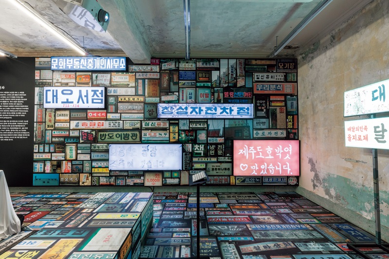
을지로체가 단순히 서체를 넘어 사용자들 사이에서 레트로 문화로 발전하는 동안 배민은 재개발로 옛 모습을 하나둘 잃어가는 을지로 일대의 풍경을 기록하기로 했다. 을지로의 간판들은 개인이 아닌 공공의 산물이라는 깨달음 때문이었다. 성장과 쇠퇴, 부활을 반복하며 끈질기게 생명을 이어 온 을지로의 역사에 주목한 것이다. 누군가에게는 생존의 터전인 그곳을 일회적인 마케팅 수단으로 사용한 데에 대한 반성도 있었다.
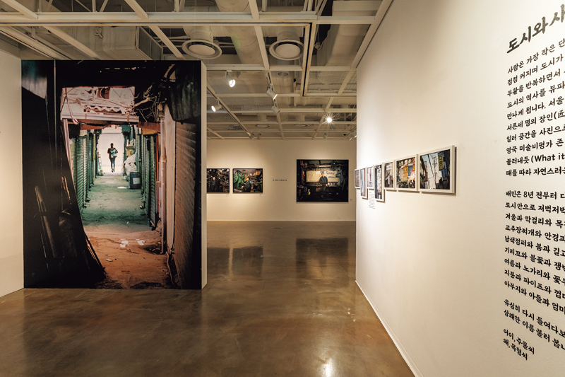
The Euljiro font also attracted retro culture enthusiasts. When Baemin realized it had a style statement on its hands, the company saw an opportunity to not only promote the font but also raise awareness of the ongoing redevelopment that was slowly robbing Euljiro of its character. Baemin collaborated with internationally acclaimed photographer MJ Kim, who spent six months exploring the area, recording the narratives of locals of all ages and professions, from seasoned blacksmiths to budding artists.
간판의 시각적 매력에서 출발한 프로젝트는 지역과 사람에 대한 관심으로 확장되었다. 배민은 관록 있는 사진작가와 손잡고 6개월 동안 을지로를 돌아다니며, 수십 년 동안 이곳을 지켜 온 장인들의 이야기에 귀를 기울였다. 나이 지긋한 철공소 사장부터 젊은 예술가들까지 폭넓은 연령대와 직업을 가진 을지로 사람들의 이야기를 글과 사진으로 기록하고, 2020년 이를 주제로 한 전시 < 어이, 주물(鑄物)씨 왜, 목형(木型)씨 > 를 개최하며 또 한 번 세간의 화제를 모았다. 전시 준비의 일환으로 을지로의 오래된 간판을 수집하는 과정에서 다음 서체의 아이디어를 얻기도 했다.
In 2020, his photos of the faces of Euljiro were displayed at the Sejong Center in Seoul in an exhibition titled Hey, Mr. Jumul. What, Mr. Mokhyeong? in reference to the cast iron and wooden molds used by Euljiro’s craftsmen and artists. What began with the visual attraction of old signs had grown into an interest in the neighborhood and its people. In preparing for the exhibition, Baemin also came up with the idea for its next font.
“세월에 마모되어 페인트가 벗겨진 간판이 의외로 멋스럽더라고요. 그 모습 그대로 또 다른 을지로체를 만들었는데 반응이 꽤 괜찮아서, 나중에는 아예 글자가 완전히 닳아 없어진 버전까지 출시했어요. 중간에 계속 문장을 만들고 테스트하면서 완성도를 높였죠. 어떻게 하면 글자가 더 자연스럽게 닳아 보일지 고민하면서요.”
“The weathered signs, whose paint had peeled off over the years, looked quite stylish. It inspired us to develop another Euljiro font, reflecting that worn-out look, and people’s reaction to it was quite positive,” Han says. “We went as far as releasing a version where the letters had essentially faded away. We continued to refine the new styles, contemplating ways to make the wear appear more natural.”
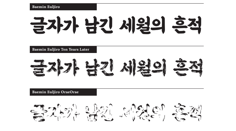
배민이 2020년 후속으로 내놓은 을지로10년후체(Baemin Euljiro Ten Years Later)는 을지로체의 10년 후 모습을 상상하며 만든 것으로, 햇빛과 비바람에 바랜 듯한 글자가 특징이다. 그 이듬해 발표한 을지로오래오래체(Baemin Euljiro OraeOrae)는 글자가 거의 눈에 보이지 않을 정도로 흐릿하다.
The former of these two fonts, named “Baemin Euljiro Ten Years Later,” was unveiled in 2020. It replicated the look of a ten-year-old sign, its letters weathered by exposure to the elements. The latter, named “Baemin Euljiro OraeOrae” and released the following year, is so faint that the letters are hardly visible. (“Orae orae” means “for a long, long time.”)
3년에 걸쳐 을지로체 시리즈를 선보이는 과정에서 배민은 그들만의 확실한 아이덴티티를 가진 기업으로 성장했다. 을지로체가 배민의 사업 성과에 직접적인 영향을 미친 것은 아니지만, 그것이 일상에 미친 문화적 파급력은 기업의 일반적인 브랜딩 효과를 훌쩍 뛰어넘었다. 서체 개발을 계속 이어가는 동력에 대한 한명수 COO의 답변이 흥미롭다.
“말하자면 창의적 기업가의 욕망 같은 거예요. 크리에이터는 많은 사람들에게 지지받기를 원하는 존재니까요. 내가 참여한 프로젝트가 문화가 되고, 사람들이 그것을 향유하는 모습을 보는 게 너무 즐겁고 행복해요.”
During the three years in which the Euljiro font series was introduced, Baemin evolved into a company with a distinct identity. Though it didn’t directly impact the company’s performance, the cultural influence of the Euljiro fonts on everyday life exceeded expectations. “Creators aspire for widespread acceptance of their work. Witnessing projects to which I’ve contributed being incorporated into culture and embraced by people has been really enjoyable and makes me happy,” says Han.
강보라(Kang Bo-ra, 姜보라) 작가
Kang Bo-ra Writer